
Brand IDENTITY - We Pine Films
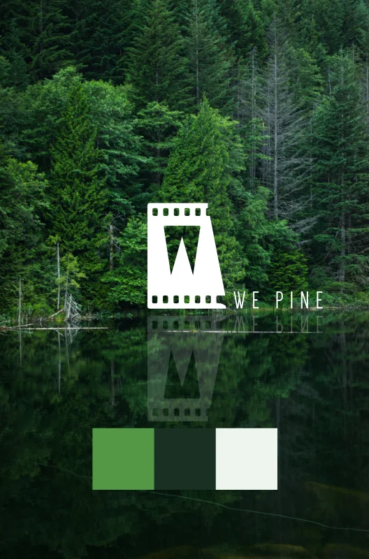
Company Logo
We Pine Films has an expertise in film and visual storytelling; there is a very raw and organic quality to their work. It was critical to mirror this and to accentuate it throughout their brand profile. The logo and colors needed to be simple, to match the simple elegance of the work; in this way it would mirror their films -- simple, beautiful content presented on a natural stage.

Brand DEVELOPMENT
It was important to capture the timeless quality of the brand. To pine after, to endure through all seasons of life; that idea correlated powerfully with evergreen trees' ability to survive through the literal seasons. The world, after all, is not ever-green, and there is beauty in the harshness of this existence. Showing the versatility of the brand in different seasons helped enforce the ever-enduring, evergreen soul of We Pine Films, and also helped to inform an appropriate palette.

PALETTE
They are evergreen, first and foremost. But they embrace the sweltering heat and the bitter cold -- some of the most beautiful stories come from the most unforgiving environments, and that was the guiding principle for this color scheme.