Brand DEVELOPMENT - LYSRO Styling
BRAND DEVELOPMENT & BUSINESS CARDS
For a fashion stylist, new clients are the key to growing a business. In the fashion industry, relationships can form out of nowhere; leaving an impression and staying fresh on the minds of potential clients is critical. For Lysro, there was an already-existing logo created by the founder that was desired for the finished product. My direction was to experiment with a few different looks for the text just in case, but mainly to create a simple, solid visual that would communicate the mission of the business at a glance.
Initial Concept 1
Initial Concept 2
The clothing hanger theme really resonated with the founder. She liked the first concept slightly better, but liked the black & white aesthetic. I pursued a blended approach; more like the first concept in terms of design elements, but with the look and feel of the second:
2nd Round Concept 1
2nd Round Concept 2
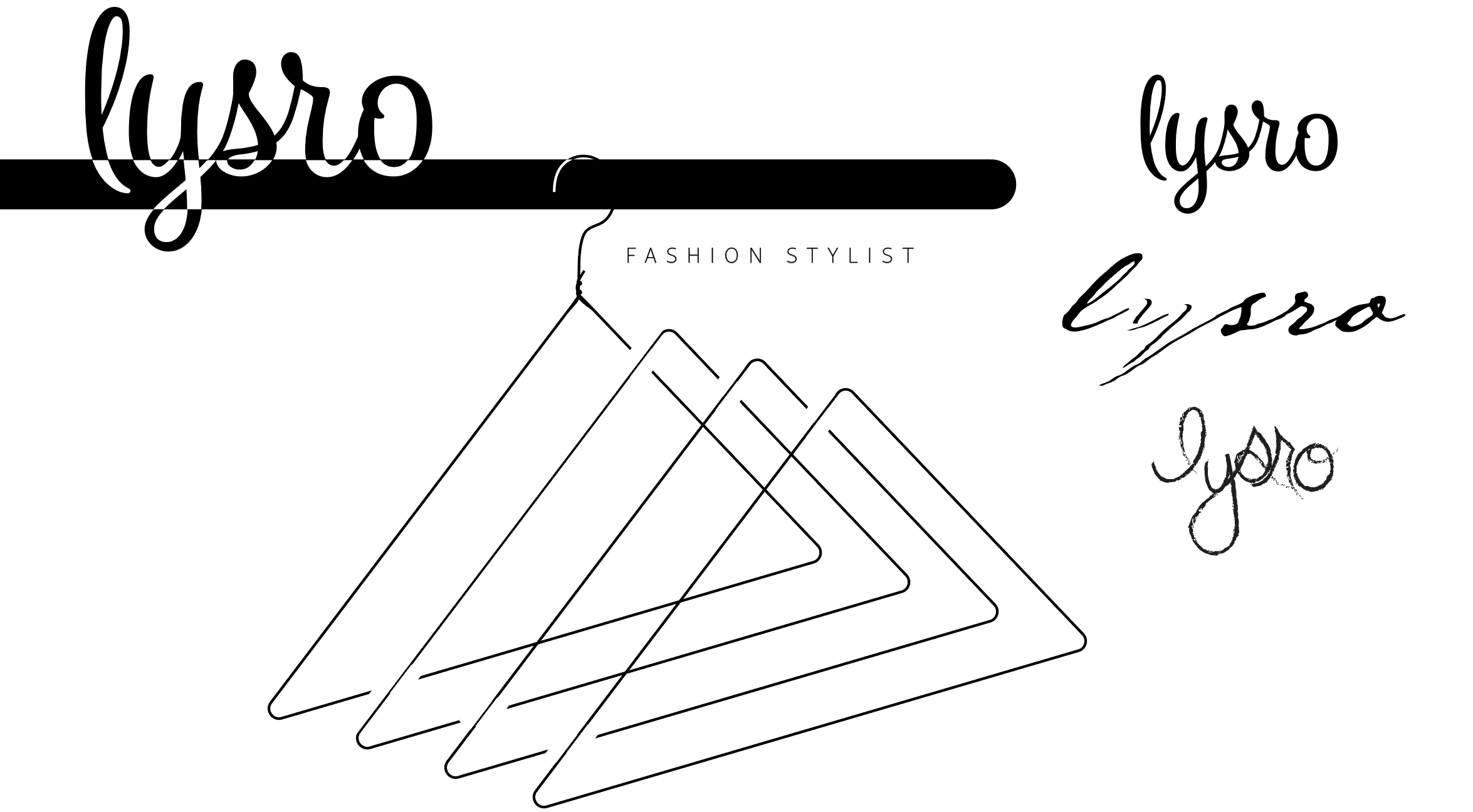
A second round of concepts, showing a couple different looks at a more simplified, black & white visual. I wanted to show a few different fonts (including the already existing logo) and visual elements, even though the concept was pretty much solidified.
3rd Round Concept
Final Concept
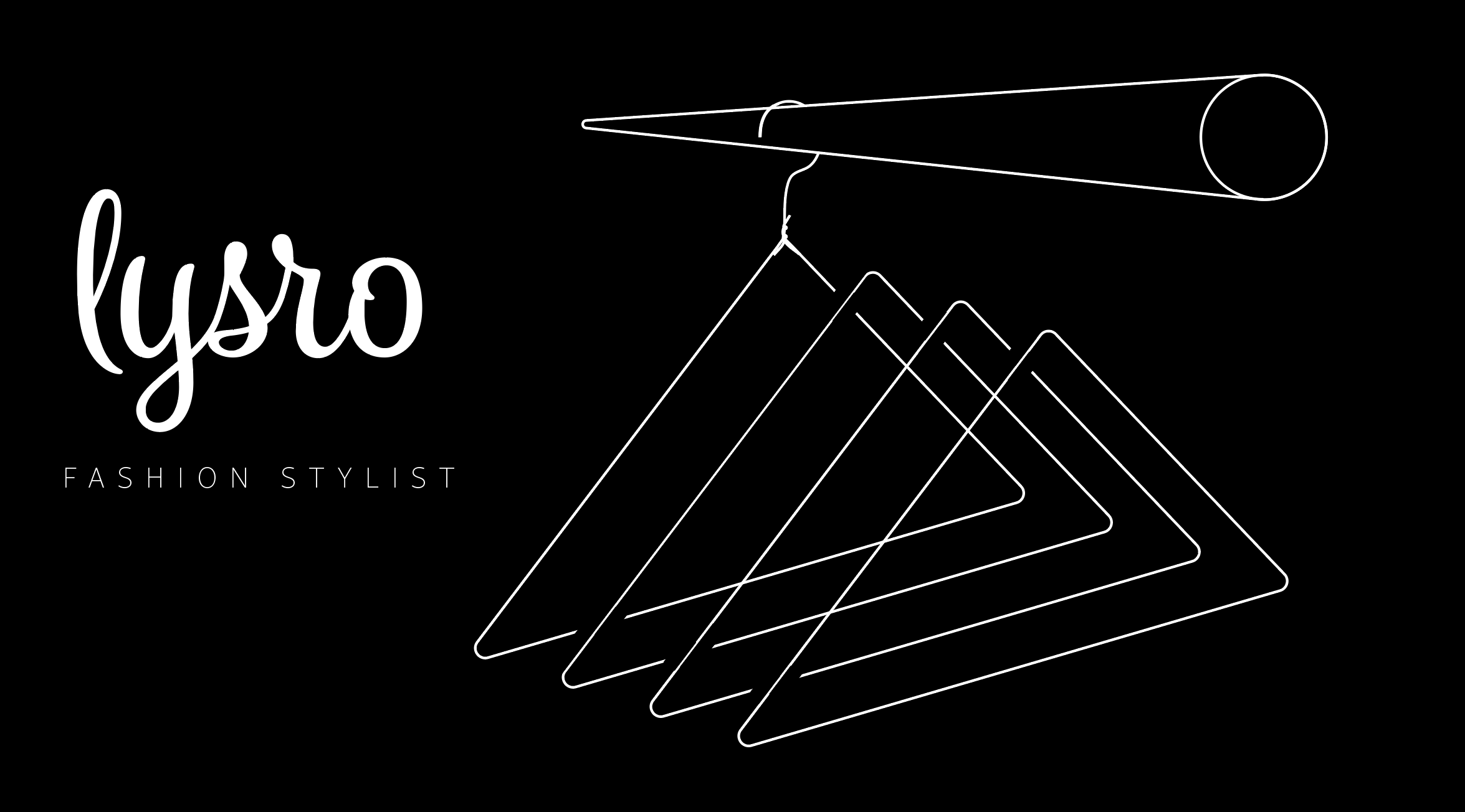
The founder decided to stick with her original Lysro script logo, so I took one final stab at a slightly different look for the hangers, mirroring the texture of the logo itself. We went back and forth a few times, and she decided to go with a simple, singular line-width for the design elements, to match the line width of a tattoo she has! The joys of projects like these are in starting bold, and then selectively simplifying, all while staying in line with the brand.


